

← Back to portfolio

HealthInsurance.com: Plan Selection Tool

Choosing a Medicare Advantage plan is confusing, anxiety-inducing, and often ends in a 30-minute phone call. We tried to make the "Expedia of Medicare Advantage" — it wasn't as simple as it sounds.

CompanyBlue Lantern Health
RoleVP, Product & UX
FocusInsurance marketplace, plan comparison
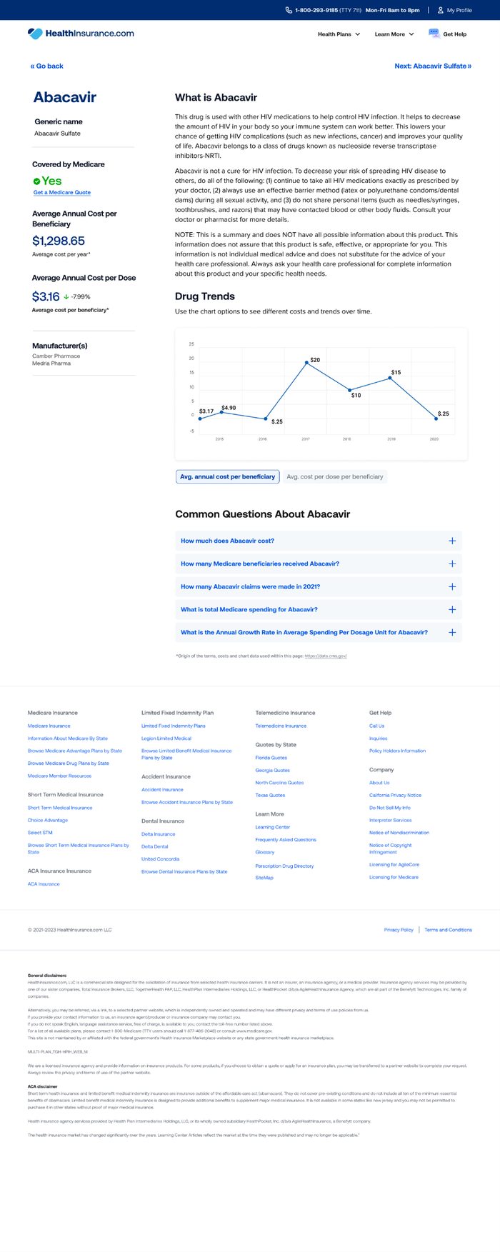
HealthInsurance.com plan comparison screen HealthInsurance.com plan detail screen HealthInsurance.com plan filter screen
Problem statement

Too many plans, too little clarity

  • Some zip codes have more than 100 available plans
  • Many plans carry a $0 monthly premium and become indistinguishable from each other
  • Confirming doctor and drug coverage requires real research
  • By definition, over 99% of potential customers are 65 or older
How might we help customers confidently choose the right plan themselves?
Business impetus
  • A closed sale via the call center took nearly 30 minutes
  • Time on site after reaching the plans list was usually under 60 seconds
  • Over 90% of "high-intent" online shoppers transitioned to the call center anyway
  • A call-center-driven model doesn't scale

Underneath it all: tremendous anxiety about picking the "wrong" plan, low opinions of health insurance generally, and real difficulty predicting future usage.

Research

Grounding the design in real behavior

We interviewed potential customers and mapped their purchase journey to find opportunities, ran competitive research across the marketplace, and interviewed 10 seniors and 5 caregivers to start a research library — noting where AI-generated stand-ins were used instead of real participant photos.
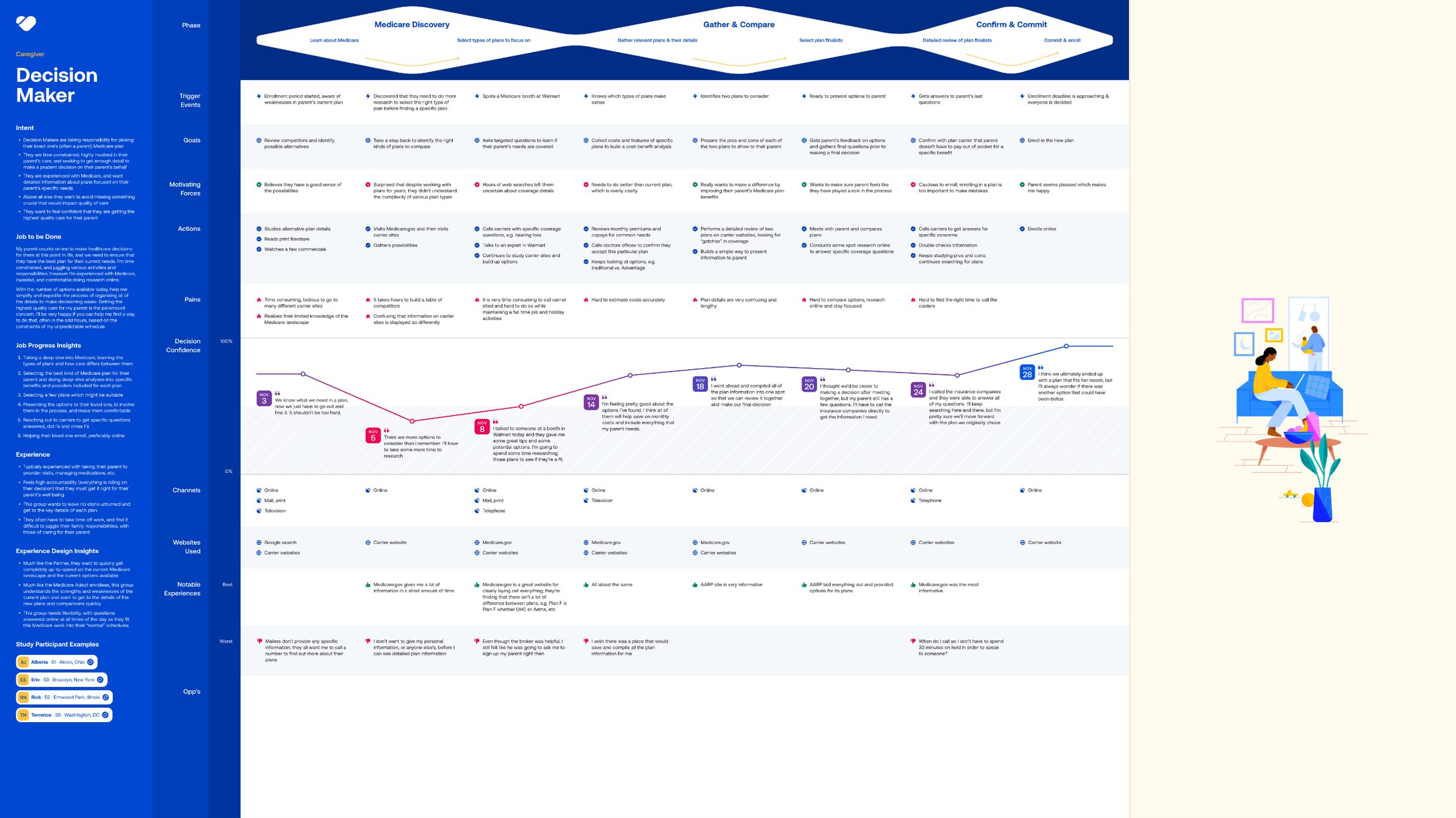
Customer journey map for a Medicare decision-maker persona
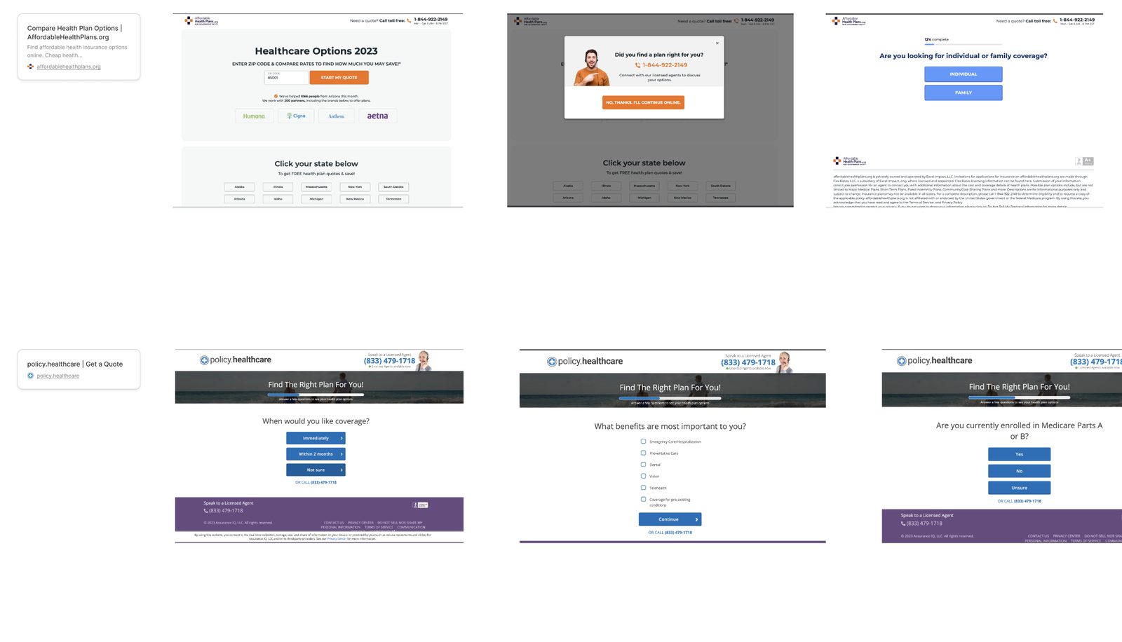
Competitive research screenshot of a rival Medicare plan finder
Competitive landscape

Learning from the field

We performed competitive research to find strengths and weaknesses across the marketplace, then mapped the results of the competitor landscape to see where a genuinely better experience could live.

Challenges

Four tensions that shaped the flow

01

Getting information vs. asking too many questions

More demographic information helps serve and recommend better — but requesting more of it means higher drop-off. We had to weigh fewer, denser pages against many single-question pages.

02

Suspicion about providing information

People were afraid of being sold to, trained by other sites where reaching the end of a funnel makes you a lead, not a result. They wanted a general sense of pricing before investing much time.

03

Two very different customer profiles

Seniors buying for themselves vs. adult children buying for a parent — with opposite appetites for phone conversations, opposite appetites for online sales, and different starting knowledge.

04

Data structure and specificity

Drug names are easily misspelled or forgotten; the drug database needed dosage, quantity per container, and refill rate to produce estimates. The doctor database needed location to determine coverage, and the pharmacy database sometimes needed to know the specific branch.

Success metrics

What we optimized for

Online conversion rate

Increasing self-serve completion

Call center handoff timing

Later in the customer journey, not immediately

Self-browse rate

Percentage who chose "I'll browse all plans myself"

A/B/C survey testing

Straight to plans vs. shortened vs. longer survey
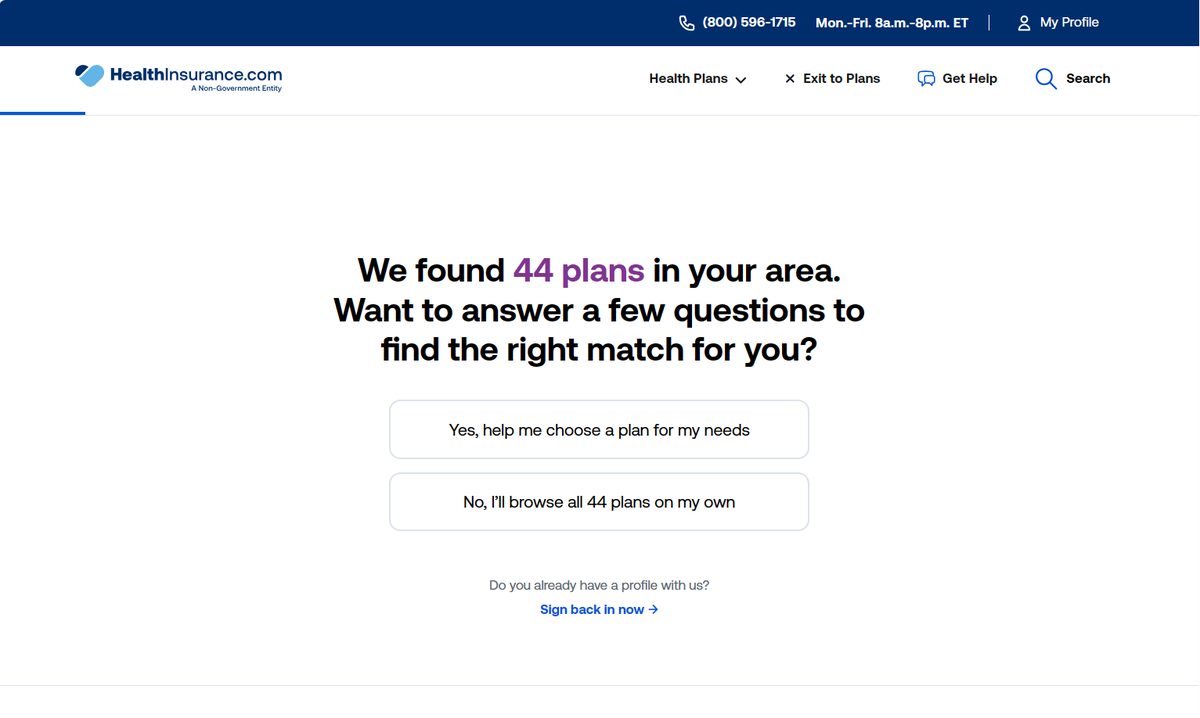
HealthInsurance.com plan match screen
The simple truth

People take the shortest path — even a worse one

  • "Laziness" prevails: customers reliably chose the shortest path, even into sub-optimal outcomes
  • Conversion rate doubled in the "direct to plans" variant
  • Under 4% engaged with the Plan Recommendation tool, versus nearly 15% with the "comparison tray"
  • A short vs. long questionnaire A/B test showed no statistically significant difference
Corrections: default to showing plans immediately and gather information in smaller bites; organize information non-linearly instead of as a wizard flow; and meet people inside the tools they already use most, like the comparison tray and product filters.